
Editor’s Note: All opinion section content reflects the views of the individual author only and does not represent a stance taken by The Collegian or its editorial board.
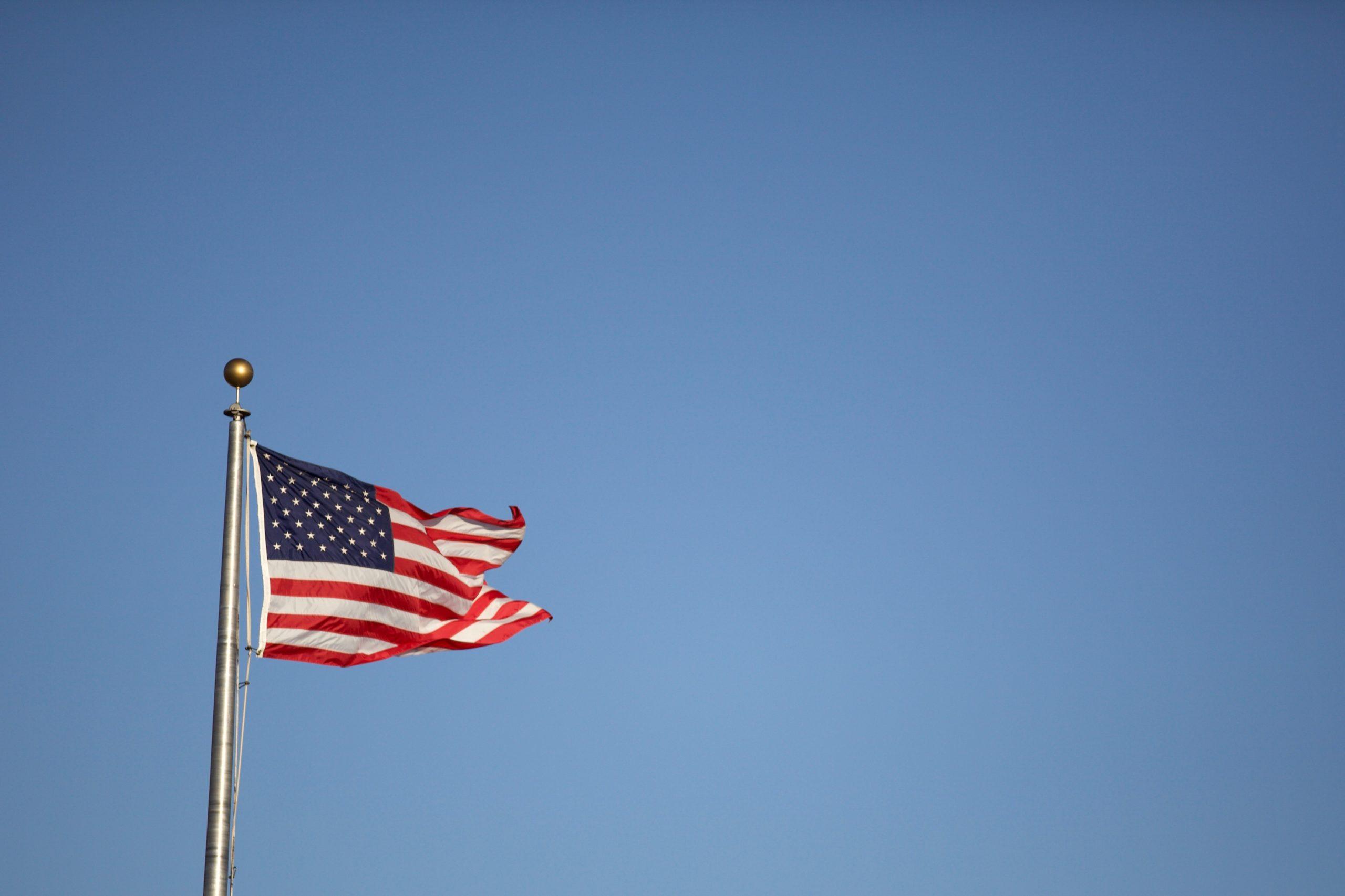
Every flag is designed as a symbol. Whether they don stars and stripes, the not-so-aptly-named stars and bars or just a corporate logo on a white banner; every flag represents an idea, organization, nation or religion with which people identify. As a result, every flag, to some extent, is an extension of people themselves. Flags are us.
There are hundreds of flags for cities and municipalities that are created and based solely on geography. In the United States, especially, city flags hold lots of power. They can become a symbolic icon for any given city, or they can turn a city into an international laughing stock.
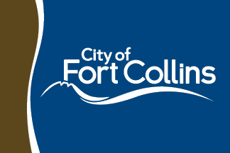
All that in mind, I was driving near the Larimer County Justice Center, and I noticed a flag I’d never seen before in front of the building. It was disgusting; it was brown and navy blue, had weird striping and an oddly off-center wordmark. It was the flag of the City of Fort Collins.
We need to change the Fort Collins flag because our beautiful city deserves better.
American city flags, more than most others, are meant to be icons. U.S. city flags aren’t designed to be symbols of political power but recognizable icons of a city. As a result, city flags need to be more thoughtfully designed. They need to be recognizable and distinctive because cities don’t have the inherent power of a nation, religion or ideology.
Let’s take some inspiration from the flags around us because, after all, Fort Collins is surrounded by good flags.”
An example of a well-designed flag that does its job is the Chicago flag. This flag is featured all over the city’s streets, tattooed on peoples’ arms and Chicago cops are even required to wear it. It’s recognized as one of the best American city flags and is an example of a flag done right.

Now compare that to a bad flag, namely the now-former — and now-infamous — flag of Pocatello, Idaho.
Roman Mars, who hosts a podcast dedicated to critiquing the design of mundane objects including flags, called Pocatello’s flag “the worst city flag in North America.” After recognizing the disdain for the flag, Pocatello changed it in 2017. Years later, the chaotic flag is still something of a meme that the city can’t seem to shake.
Between the two, I’m sure you agree that the Fort Collins flag is a lot closer to the Pocatello flag than the Chicago flag. We need a new flag — a good flag — and we need it desperately.
Before we all open Photoshop and start trying to make a new civic symbol, it’s important to understand what makes a flag a good flag.
The North American Vexillological Association lays out five guidelines that every good flag should follow. Those guidelines emphasize simplicity, meaningful symbols, basic colors, no letters or words and distinctiveness.
The Fort Collins flag breaks three of these rules. The brown it uses doesn’t contrast well with the blue, the City’s wordmark appears on the flag and nothing about the flag other than the generic wordmark screams “Fort Collins!” If one removed the lettering, it could easily be a flag representing any city in the world with a river in it.
That being said, let’s take some inspiration from the flags around us because, after all, Fort Collins is surrounded by good flags. The Colorado and Wyoming state flags, the Denver flag and the Loveland flag are all some of the best in the country. They mostly follow the guidelines, and they do it well.
They all have one thing in common: capitalizing on easily recognizable imagery that is unique to their location. If Fort Collins wants to do the same, we need to identify imagery that’s unique to this community.
The first things that come to mind are the green of Colorado State University’s branding, the shape of Horsetooth Rock, the red mesas around Horsetooth Reservoir, the white of the snow that blows in every winter and the blue of the Cache la Poudre River that flows through the City.
All of that in mind, I spent about five minutes whipping up a new flag for Fort Collins. It hasn’t gone through the eons of critique that almost every flag faces before it becomes official, but it’s a start nonetheless:

It’s worth noting that there’s already opposition to the current Fort Collins flag. Citizens started a petition to attempt to change the flag, and while it hasn’t caught any traction yet, there is still hope that it might.
Whether you like my design or not, you have to agree that the current flag sucks. We deserve better. So share this article, sign that petition and maybe even design your own flag. It might just be the City’s next design.
Dylan Tusinski can be reached at letters@collegian.com or on Twitter @unwashedtiedye.